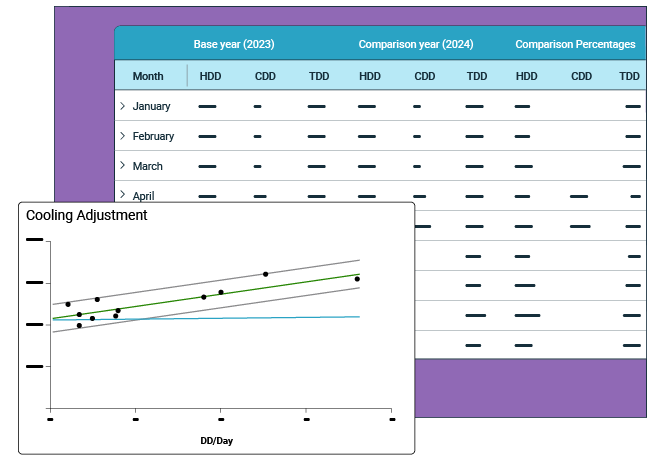
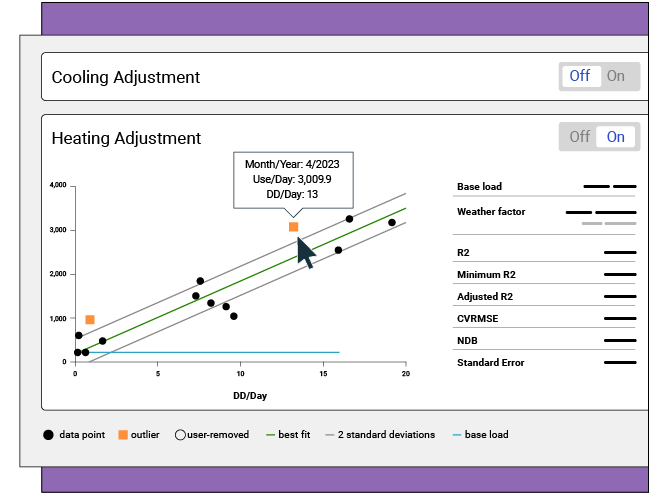
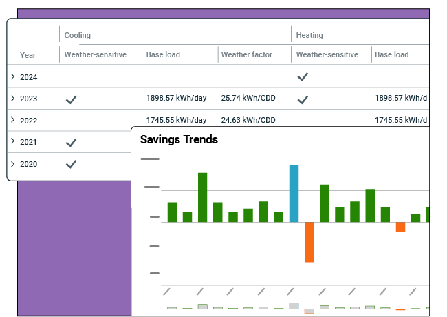
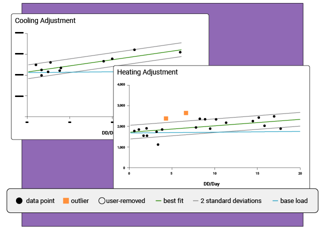
![](https://www.energycap.com/wp-content/uploads/2022/06/hyv5asap6y_w768-300x98.jpg)
Use vs. Weather graphs in EnergyCAP UtilityManagement reveal correlations between the two variables. By comparing monthly degree days with meter energy use, it is possible to determine if the meter is weather-sensitive. How does EnergyCAP UtilityManagement know when a meter is weather-sensitive? A linear regression analysis is used to model the effect of degree days on energy use reported on each bill.
A degree day measures how hot or cold it has been over a 24 hour period in order to understand the energy demand for heating and cooling during that time. A degree day is calculated by taking the mean temperature for a given day and comparing that mean temperature to a base value—often around 60 degrees Fahrenheit. The colder (or warmer) the weather, the more heating (or cooling) degree days are applied, and the more energy usage is required to keep buildings comfortable.
Degree days:
On Cost Avoidance Baseline Charts, the vertical axis is the average daily use, and the horizontal axis is the average number of heating or cooling degree days per day. Each black point on the chart represents a utility bill, and the green line is the regression, or best fit, line across these points. If the regression line rises from left to right, it means that months with more degree days have more use, suggesting that at least a portion of the energy usage is weather sensitive.
The horizontal blue line is the non-weather base load and represents energy consumption for things like lighting, appliances, domestic hot water, and electronics.
The two parallel gray lines indicate two standard deviations from the regression line. Any point that falls outside of these lines is considered an outlier, or a point outside the model and not easily predicted, and is indicated by an orange dot.
Determining whether a meter is weather sensitive is imperative for accurate cost avoidance calculations. When a meter is weather sensitive, the baseline use is adjusted up or down. This allows non-weather energy consumption to be evaluated independently, accurately estimating costs avoided over time through successfully executed energy projects.
The green best fit line on the Use vs. Weather chart is determined by single linear regression, a type of modeling that estimates the relationship between two independent commodities. You can run a regression analysis of these points in Excel and you will see the exact same results.
Our energy and sustainability ERP brings cross-functional teams together, in a single platform, to drive cost-effective and responsible utilization of finite resources.